Wednesday, December 25, 2013

Fishy

Pretty fishy :))

This piece is also a project from Art III. It is the result of an assignment where we used silk dye. I'd done something similar to this in eighth grade, when we used wax and stuff to batik with a visiting artist. This time, we use gutta and fancy silk dye that stains your fingers and clothes.  (I think my fingers were blue for a while.)  I chose a fish because I thought I could do some cool watery stuff with the dye and because I secretly like fish almost as much as sheep.  I wish I had a picture of the watercolor I made as a sketch because I actually like it better than the final product... Probably because I spent days on the watercolor and the silk actually went more quickly than I expected.  I had some fun with salt, which gave it a kind of bubbly look in some spots.  It was great fun :))  Like I said I'm not as happy with the final as I was with the sketch, but it was something new and I did have a lot of fun making it.

The Beautiful Laura

So this piece is one that I made almost two years ago as my "final project" for Art III. I really enjoyed painting a watercolor of my little brother Jonathan earlier that year, so I decided to do another. I picked out a picture of Laura from when we got our pictures taken earlier that year.  I don't remember whether I projected and traced the image onto the 18"x24" watercolor paper....I think I just drew it out the best I could. I then painted the whole thing with watercolors. I probably could have used a bit more value in the face. I hadn't really worked this large with watercolor before, besides the portrait of Jonathan, and it was a bit tricky to keep it wet so I could blend it all like I needed to. It was also difficult to make her hair really dark like it needed to be, but I think I managed pretty well with that one :)

 My favorite parts are the dress (this picture got cut off a bit... you can see more in the original. I jus kind of squiggled the brush around) and her eyes, which are just gorgeous in real life. Overall I was very happy with how this piece turned out; it is one of my favorite things I have ever done.

Monday, December 23, 2013

I am not left-handed

This is a sketchbook assignment from a couple months ago. I rediscovered it while flipping through my sketchbook and thought I'd share it with y'all :))
It is a self portrait drawn in pencil with my left hand.
I'm beautiful ;)
I am not left handed.

I like sheep

In case you didn't notice from one of my previous posts, I like sheep.  I decided that I wanted to paint a sheep with oils.  So I printed some references:
Sheep!  I chose that guy in the middle as my model.
All of these sheep are a weird off-white color, and that's no fun, so I decided to add a little more color into the wool.  I did the shadows with purple and the highlights with yellow.  It was a bit tricky not to make it muddy, especially because purple and yellow make brown... I think I did a pretty good job though :)
First I did a red-orange wash on my square canvas.  I think the orange color helped me make the blue of the sky as bright as I needed to.  I spent most of my time on the sheep trying to get the texture and values just right and finished up with the sky and the grass.
It's a beautiful sheep.
Sorry this picture was taken at a weird angle...  It was still wet so I left it at school over the break and I will take it home to take a better picture when we get back :))
This is probably my favorite piece I've done this year.  I love how it's realistic-ish and abstractish at the same time.  I also enjoy telling people it's a self portrait and explaining that "Rachel" means "ewe" even though that's not a very funny joke.  I can't wait to bring it home :))

Thursday, December 5, 2013

Anxiety Monster

This piece started as a sketchbook project.  The prompt was "the concept of anxiety."  I thought, what does anxiety feel like?  It feels like a fat nasty monster squatting on your shoulders and scratching at your face, making you super tired but you can't close your eyes.  Anxiety feels like insomnia and panic and tension and like you're slowly oozing all your energy out of your ears and like you want to cry yourself to sleep but it's not allowed to be bedtime yet.  So that's what I drew.
sketch in colored pencil and Prismacolor markers

It's kind of creepy, and it makes me a little uncomfortable and a little scared, but hey, anxiety itself makes me a lot uncomfortable and a lot scared.  I accidentally made her (who is kind of me) look a little zombieish, which is not totally what I was going for... She's not dead yet, she just feels like she's on her way there.

I talked to Mrs Rossi and told her I wanted to make it a real project, and she told me mixed media would be cool.  And it just so happened that we were experimenting with visual journaling that week.

Best. idea. ever.  Thanks Mrs Rossi :))

eww.

So I started by printing off some pictures of rats and ROUSs (rodents of unusual size) and lizards and lizard feet as references and to kind of put some method in my madness.  Then I just started gluing stuff down.  I used tissue paper, wall paper, old patterns, newspaper, charcoal, paint... It was a lot of fun.  I just kind of kept on going.  At some point, though, I decided I didn't want to overdo it so I had to stop.
This by itself was cool and all, but it didn't really mean anything.  It's just a background.  So I looked in a mirror and drew a face, so I guess it's kind of a self-portrait, but I took a lot of liberties.  I also kind of forgot about my nose.  I don't really need that, do I? ;)  I watercolored the face and gave myself some oil pastel hair and glued myself down.
Um, on second thought, I think I do need a nose.

It's not done yet... I still have to do the monster.  Kind of the most important part.  I'll let you know how it turns out :)

Update: Just to clarify - This piece/post is a hyperbole of my feelings.  I'm fine, really :))

Kathryn on the Couch

I started this piece this summer at an oil painting/figure drawing workshop with Rose Datoc Dall at SVU.  I got to paint from live models instead of just photographs for the first time.  Which is SO COOL.  It was tricky, though, because people aren't statues... they move!  But it was much better than working off of a photograph.
It was really cool to see all the different styles and perspectives of the same model.  Oh and my piece is right in the middle there :))
I was super super nervous about the whole thing, because I'd never used oils before and they seemed really intimidating.  It was kind of super overwhelming to go to the art supply store and find the brushes and everything that I needed because there is just so much stuff.  And for some reason oils just seem so fancy and official to me, like only "real" artists are allowed to use them.  Which means they must be super hard to use, right? And you have to be a super fantastic artist to be worthy to even attempt, right?
Okay, so I'm exaggerating a little.  Anyways, the point is, I was a little freaked out for no good reason.  It turns out... I love oils!  It turns out you don't have to be official and fancy to use official fancy paint.  I ended up using oils for the first project I did for this class, the pair of pears.  Because they're awesome.
I didn't have enough time to finish the painting over the summer, so I decided to pull it back out again and see what I could do to finish it up.
In progress... 
Still in progress...
(I apologize for the quality of pictures taken with my cell phone... Shame on you, cell phone.)
Kathryn on the Couch
My palette... Kind of all the same color.

I kind of messed up the colors of the fabric we wrapped Kathryn in (whoops), so I had to invent a color for the background.  I also added some more dimension to the fabric with highlights and shadows, and deepened the shadows on her skin since I was scared of the dark this summer so she is super pale.  Confession: I'm still afraid of the dark.
(Paint, that is.)


You'll notice she doesn't really have a face, or fingers.
Oh, I forgot about her shoulder. Better go paint that.

I just didn't want to paint them, so I didn't.  Artistic license, you know.  You'll notice she has toes.

That's as much as I could handle.

Toes!
My favorite part
Overall I'm happy with this piece. I looooooove the colors, and I'm pretty proud of myself for putting my big girl pants on and trying oils.  It's not as scary as I thought it would be.  I think it gave me some confidence to explore with other new media, like mixed media for visual journaling.  And, you know, sprinkles.

Friday, October 25, 2013

Ewww, what's in that jar?

This piece is kind of special to me because it's not like anything I've ever done in art class before, but it's almost exactly like every single thing I do outside of art class.  I'm a big doodler - I love to draw little people on the sides of my history notes, letters, journal, math homework... basically everywhere.  If they're not acting out whatever I was writing about, these little people are actually me, or like a weird little cartoon version of my inner self that describes how I'm feeling.  Kind of like cartoon-Lizzie from the Lizzie McGuire books and TV show.

Anyways, one day in English class, I was thinking about the "That's Buggy" and "Glassed Over" themes and doodling instead of participating in the discussion.  I came up with this little girl:
Hey, it's a very rough sketch.

It's kind of goofy, but I liked it, so I did a sketch for reals in my sketchbook with color and everything:
Haha that elbow.  If you can call it that.
I hesitate to call it a self portrait, but it kind of is.  Actually, I got my lovely sister Laura to pose for me so I could fix that elbow, etc., so it's kind of a portrait of her...?
My lovely Laura.  She's the best.
The dress in the sketch above is a piece of graph paper I found among the papers I've stuck in the front of my sketchbook (good thing I never got around to cleaning it out, right? ;)) which I had drawn this pattern all over just for funsies because I like patterns.  I made it blue with an acrylic wash and glued it in with a glue stick.  Then, I figured I might as well keep going, so I cut the shape of the jar out of a ziplock bag and glued that on.  You can't tell from the scan but it's all shiny.  It was fun, and I wanted to keep on going, so I decided that's how I would do the final project.  I sketched out the final on a piece of poster board and traced it with tracing paper so I could trace the shapes onto my other papers, which include scrapbook and construction paper, more graph paper, tracing paper, a brown paper bag, tin foil, thread, and another ziplock bag.  (I guess those last three aren't actually paper....)  It was tricky to cut it out and glue it down so it all came together like it should and looked like I meant it to.  As is usual when I work with glue sticks, I was hugely frustrated by my inability to keep the glue from getting graphite and eraser crumbs and other nasty stuff in it and making a sticky, pencil-y mess.  Let's just say that glue is not my favorite thing to work with.  I managed to keep damage to a minimum and my piece emerged from my glue-stick nightmares relatively unscathed.  Yay.
One of my topics for this piece is opacity.  I played around with the plastic from the baggie and the tracing paper to try and make the jar look see-through but also like it was, you know, actually there.  I'm kind of still working on that, actually.
So here it is!
"But only with the lid on"
This actually makes me really happy.  I kind of feel like it's missing something...maybe something to emphasize the three-dimentionalishness of the jar.  I'm workin on it :)
I've just been looking back at my other pieces from this year and I've realized that I'm all over the place!  Like I said before, this piece is more like the stuff I tend to draw everyday.  But the other pieces I've made are some of my favorite things I've ever done ever.  Maybe by the end of the year I'll have a more distinctive style as an artist.  Then again, maybe not.  It's more exciting this way :))

Monday, October 21, 2013

Sprinkles!

Finally! I was so ready to be done with this project.

The brainstorming for this project didn't follow the usual pattern... The idea occurred to me one night at 11:30.  I saw the bottles of sprinkles in the pantry, and for some crazy reason, I decided it would be a great idea to make a sort of mosaic out of the sprinkles.  I wish I had a picture to show you of the first little design I made, but it turns out that Elmers glue isn't exactly the best at keeping sprinkles in a sketchbook. Sorry.
I decided that I wanted to make a face out of the sprinkles. I thought it would be best to work straight from a picture. I found this picture on my computer from a couple years ago.
the original picture

It was perfect, since it already had the highlights and shadows kind of blocked out in different colors. I traced the picture onto a 8"x10" canvas board and filled in the color with an acrylic wash.
After the 1st day

I couldn't find sprinkles sold in separate colors, so I spent a while (read: WAY too long) sorting my multicolored sprinkles into their own little pile. Once I finished that, I used rubber cement to glue the sprinkles on one by one.
It was slow work.
A self-portrait... in sprinkles

I'm pretty proud of myself for not messing up my eyes and my lips.  It definitely felt unfinished...  I needed some way to ground it so it wasn't floating on the canvas.  I decided I wanted to bring out the blue of the eyes, so I painted the canvas with acrylic with a palette knife.  I also dropped some sprinkles  into the wet paint to add some texture.
Tada!

I chose "warped" as my theme.  My topic is "line."  I was careful while gluing on the sprinkles to follow the contours of my face so the lines give the illusion of form.  It only takes one sprinkle out of place to break the line and change the way our brains interpret the shapes.
  I'm surprised at how well it turned out. I am so ready to be done with this project and move on to the next.  I actually started to add some hair, because I feel like I kind of need it, but that will have to wait for now.

Wednesday, October 9, 2013

Icarus

The brainstorming for this piece actually started way back with the "pairs" piece.  As I was thinking of things that came in pairs, I thought of wings, which made me think of the Greek myth of Icarus and Daedalus.  (If you don't know this story, look it up!  This piece doesn't make a lot of sense without the backstory :)) I drew a little sketch of Icarus, falling out of the sky, but I decided that pears were much funnier and forgot about Icarus until it was time for my third project.  I just had a really cool picture of Icarus in my head that I wanted to put on paper.  Only problem was, it was kind of more of a movie than a picture so I wasn't sure exactly what I was going for.  I found a LOT of pictures on the interwebs of Icarus falling out of the sky.
Yay for references!
  The original plan was a realistic-ish drawing in colored pencil or something.

Haha. He has teeny feet.


 After sketching that out, I remembered one teeny detail... Realism is NOT my thing.  Not when it comes to bodies!  To avoid major frustration I decided to wayyy simplify my idea.  Anyways, I was kind of tired of all the "falling out of the sky" pictures too.... I wanted to show a different perspective, with Icarus sinking deeper into the water once he's fallen into the sea.  Sort of inspired by Matisse, I sketched up a silhouette of Icarus.
Icarus by Henry Matisse, 1947

The theme of this piece is "Over the Edge," which is a reference to the myth.  I thought it would be way cool to draw Icarus in crayon, then crumple him up and use watercolor over the top.  (Inspired by the super cool art project that everyone else got to do in middle school, but somehow I missed it.)  I liked the way the dark color cracked across his body gives a kind of broken, maybe even burnt feeling.  In this way it connects to the original myth of Icarus--he flew too close to the sun and got pretty burnt up.

Icarian Sea
It's really not as washed out as it looks in this picture... In fact, I painted several layers on to get the deep color I was going for to imply he's sinking.  This paper soaked up water in a weird way so that it dried significantly lighter than it was when wet.  I ended up using hardly any water with my watercolor to get the tone I needed.
The final piece is about 6"x18".  Here are some more photos so you can see the color/texture:
The color here is a bit closer to the actual color of the top of the piece

Yay! Texture!

Can you see the bubbles? :)
I used some salt around the figure to suggest bubbles.  Because I wanted it to crumple, I used regular drawing paper instead of watercolor paper, so it warped and got a bit beat up.  The topic I chose is texture, so I actually like that element :)

Overall I'm pretty happy with the way this one turned out.  It's titled "Icarian Sea" after the sea into which Icarus fell in the myth of Icarus and Daedalus.

Tuesday, October 8, 2013

Object Art: Sheep!

This week we did object art for our sketchbook assignment - taking a 3D object and making a 2D piece of art out of it.  I had some press 'n seal lying around... VoilĂ ! Sheep!
Sheep!
I like sheep.

Friday, September 27, 2013

Fly Guy

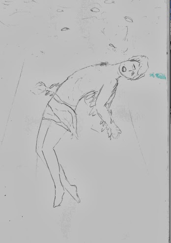
The theme of my second project is "That's Buggy." When I was brainstorming, my mind just went straight to actual bugs.  But bugs are boring all by themselves, so I was like, hey, let's combine bugs with people!  As in, people with bug body parts and vice versa or bugs that look like people.  Here are a few sketches:
Get it? Ant Jemima? Yeah, I know, it's terrible.
For whatever reason, I was really fascinated by the picture in my head that inspired the sketch on the far left.  It's supposed to look like a man in a suit that has a fly head instead of a people head, or maybe just a fly wearing a suit, I'm not really sure, but around this point I realized that I had no idea how to draw bugs.  Or suits.  I thought about abandoning the bug idea and trying something else, but I had no idea what and the picture in my head of the fly guy was just too awesome.  So I decided to figure out how to draw it.
Fun fact: That guy in the plaid up there is the Brawny Man.
I decided to do the fly guy in watercolor.  I wanted to give him sort of an "illustrated" look, and I thought watercolor with pen would achieve that effect.  (Doesn't hurt that it's my favorite medium, like, ever.)  The first study I did in the watercolor makes me crack up every time.  Look at his puny little arms!  I did another study of the suit, for obvious reasons:
Ahahaha those arms.  Gets me every time.

After kind of staring at the paper for way too long, I finally started the final product.  I have a problem with being "afraid of the dark," especially with watercolors, so my work sometimes ends up looking washed out.  (Example: those suits up there are supposed to be black.)  Add that to the fact that I haven't had an art class since sophomore year and haven't used watercolors since then... I was pretty timid and a little unsure about how this whole thing was going to turn out.

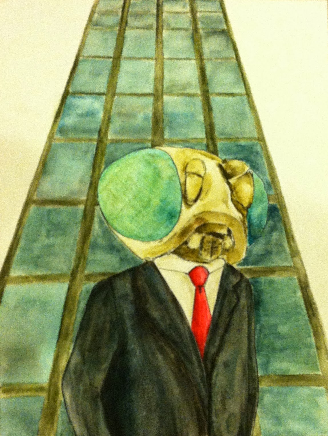
It went a lot smoother once I got over myself and just went for it.  I chose a limited color palette to make the piece less busy and really focus on the color symbolism.  I think I used six colors - ivory black, phthalo blue, ultramarine, yellow ochre, crimson, and sap green.  I don't often mix with black, especially with watercolors, because it's pretty strong and tends to make the colors a bit muddled or muted.  But that's kind of what I was going for here... so I probably used more black than any other color.   The yellow represents corruption; the red represents power; the colors on the building are supposed to be impersonal and maybe a little intimidating... Really what I think is important is the emotions that the observer attaches to the colors or images.  Maybe it speaks to you in a different way than it does to me.  That's why I love art.

That being said, here's my interpretation...

For Tomorrow We Die -12"x18"
This piece is titled, "For Tomorrow We Die."  The title is inspired by this scripture from the Book of Mormon, in 2 Nephi 28:7-9:

 Yea, and there shall be many which shall say: Eat, drink, and be merry, for tomorrow we die; and it shall be well with us.
 And there shall also be many which shall say: Eat, drink, and be merry; nevertheless, fear God—he will justify in committing a little sin; yea, lie a little, take the advantage of one because of his words, dig a pit for thy neighbor; there is no harm in this; and do all these things, for tomorrow we die; and if it so be that we are guilty, God will beat us with a few stripes, and at last we shall be saved in the kingdom of God.
 Yea, and there shall be many which shall teach after this manner, false and vain and foolish doctrines, and shall be puffed up in their hearts, and shall seek deep to hide their counsels from the Lord; and their works shall be in the dark.

While this piece was not inspired by this scripture, I think it fits perfectly.  The piece is a social commentary on those in business and politics (and really anybody today).  Flies have a lifespan of about a month.  In the same way, some people seem to be so focused on short-term goals and consequences that they fail to make wise judgments and plan ahead.   At times it seems that their only desire is to satisfy their carnal appetites.  This leads to corruption... and we all know how disgusting flies are.  When I think flies, I think of rot.  Unfortunately, our society/governments seem to be rotting, thanks to shallow, selfish people like that nasty fly guy up there.

The topic for this piece is juxtaposition.  I tried to emphasize the grossness of the fly's head by setting it right on top of a sophisticated suit and in front of and orderly/organized building.  It's funny to me to imagine a person with a fly head parading around in a suit, like he thought he was all professional and powerful.

I intend to add some color to the background at some point, but for now I'm calling it finished and setting it aside. 

Enjoy :)

Or, you know, just kind of relish its nastiness.  Whatever works for you.

Sunday, September 22, 2013

A Pair of Pears

Yay! First piece of the year!

My theme for this piece was "pairs."  I doodled in my sketchbook for a bit, trying to think of things that come in pairs... eyes, ears, hands, feet, shoes, pants... I was feeling a bit uninspired.  And then it hit me: why not paint a pair of pears?  I've always loved puns, especially really terrible puns, so it was perfect.  I printed out a bunch of pictures of pears and even stared at a few real pears for a while, then did a few sketches.
Playing around with the composition... and with my new Prismacolor woodless colored pencils :)

.... And a few more.
These pears are shaped funny.  Whoops.
I experimented with the colors of the bottom two pears, using normal colors on the left pear and their complementary colors on the right pear.  It made me remember that not all pears are yellow or green... so I decided to make a yellow pear and a red/purpley pear.  At this point I also decided to use oil paints for the pears on these cute little canvas boards (each 5"x7") I found in the bottom of my art box.  So I did a couple studies...

...And remembered how much I've always wanted to try painting on a black background.  So I busted out my new oils and started painting!
A Pair of Pears


I painted the yellow pear first and was sooo happy with how it turned out.  My topic for this piece is "form," so I had a lot of fun putting in the shadows and highlights to make the pear look more three-dimensional.  I actually didn't use any black paint (besides the background of course).  Instead, I used purple for the shadows in the yellow pear.  The purple pear was a little trickier.  I figured out that some paints are not as opaque as others, and those colors don't show up very well on a black background.  I had to play around with adding white and other more opaque colors to make the purple pear pop.  (Thanks for the tips Mrs. Rossi! :)) Also, blending and mixing and layering is a lot different with oils than with acrylics because oils take a really long time to dry.  I haven't had a ton of experience with either, but I think I prefer oils.  I tend to work pretty slowly, so I get frustrated trying to go back and change acrylics when the paint is already dry... and they make me feel like a "real artist."  All I need now is a beret and a palette with a thumb hole.

Overall I'm very happy with the way these turned out.  Who knows, maybe I'll paint some more.  I'll have pairs upon pairs of pairs of pears :)

P.S. I'd like to give a special thank you to Rose Datoc Dall-- Her figure drawing/oil painting workshop at SVU this summer helped me overcome my fear of painting with anything besides watercolors.  Y'all should check out her website and her blog. She's the best :))